
|
| ||||||
|
| ||||||
IN ITS issue of March 13th, The Economist argued that the World Bank has overstated the extent of absolute poverty in the worldthat there is less poverty than the Bank claims and that it is falling faster. A methodological debate lies at the heart of this claim. The Bank relies as much as possible on nationally representative household surveys, typically done by governmental statistics offices following international standards. The Bank's latest estimates draw on interviews with about 1.1m randomly sampled households in 100 developing countries, representing 93% of the population of the developing world.
The Bank's method of measuring poverty from surveys follows long-standing practices. But it is not the only possible approach. The Economist points to an alternative method that ignores data on levels of income or consumption from surveys. Instead the poverty measures are anchored to national accounts data, using the surveys only to measure inequalitythe shares of total income accruing to different income groups. (It is unclear why proponents of this approach think that surveys can be trusted for measuring inequality, but not levels of poverty.)
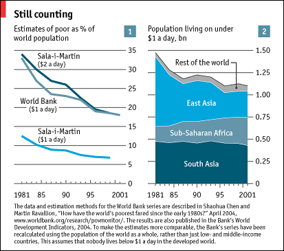
How much does the choice matter? A striking graph in the issue of March 13th compares two sets of estimates, one from the Bank's researchers and one using this alternative method, namely the estimates made by Xavier Sala-i-Martin at Columbia University. His series shows a much steeper decline in absolute poverty and a much lower level in recent years than that found by the Bank's researchers.
However, The Economist's graph is deceptive. This month, the World Bank's numbers as shown there have been superseded: the series shown began only in the late 1980s, and cannot be properly compared with Mr Sala-i-Martin's estimates, which go further back. The period under consideration makes a big difference. The late 1980s and early 1990s were a difficult time for the world's poor. Using either a longer period or a shorter one changes the picture a lot.
Chart 1 mimics The Economist's graph, but now takes the Bank's estimates further back and deals with other comparability problems (see the note to the chart). The Bank currently estimates that the world poverty rate fell from 33% in 1981 (about 1.5 billion people) to 18% in 2001 (1.1 billion), when judged by the frugal $1-a-day standard at 1993 purchasing-power parity. Compare this with Mr Sala-i-Martin's estimates. He finds that the global poverty rate fell from 13% to 7% (in 1998). Yes, the levels differ substantially. But by both methods, the global poverty rate almost halved. The two trends are also similar for the 1990s, once growth had been restored in China and India.
|
| |
 | |
|
|
Why are the Bank's poverty counts so much higher? Mr Sala-i-Martin uses GDP from national accounts to measure the average income per person of households. But GDP includes much more than household consumption; private investment and government spending, for example. This method must give lower poverty counts relative to a common poverty line.
But why would one use the same poverty line for GDP as for household consumption? The Bank's $1-a-day line is based on the poverty lines actually found in low-income countries, and those lines do not include allowances for investment and government spending; they typically include only the most basic food and other consumption needs. To compare Mr Sala-i-Martin's numbers with the Bank's, one should use a higher poverty line for the former.
It is not clear how much higher Mr Sala-i-Martin's poverty line should be to assure comparability with the Bank's $1-a-day standard. However, a good guess might be that his poverty threshold should be doubled to reflect the other items that he has implicitly included in his measure of income. Then, in fact, the two series line up rather well, as can be seen from chart 1.
Despite the methodological differences, a similar trend of long-term reduction in poverty does emerge. That is certainly good newsbut no cause for complacency. The 400m people who escaped absolute poverty by the $1-a-day standard over 1981-2001 are still poor even by the standards of middle-income developing countries. And the Bank's estimates indicate that the number living on less than $2 a day has risen from 2.4 billion to 2.7 billion.
Nor has the aggregate progress for the very poorest been shared by all regions. The number of people who managed to jump the $1-a-day hurdle in China during this period was also about 400m. So if one focuses on the developing world outside China, the number of poor has changed very little. Underlying this fact, it turns out that the composition of world poverty has changed noticeably (see chart 2). The number of poor has fallen in Asia, but risen elsewhere. It has roughly doubled in Africa. In the early 1980s, one in ten of the world's poorest lived in Africa; now the figure is about one in three.
Yes, on the whole the poorest people in the world have been doing better. But the fight against poverty is far from won.
|
| |
 | |
|
|
Martin Ravallion is research manager in the Development Research Group of the World Bank. His main research interests over the last 20 years have concerned poverty and policies for fighting it. He has advised numerous governments and international agencies on this topic.
| Copyright © 2004 The Economist Newspaper and The
Economist Group. All rights reserved. |