lmost everybody knows pollution is getting worse, few
whites are missed in census counts,
and the federal budget is in balance. Unfortunately, almost everybody is wrong. None of these
things is true, at least not exactly.
If that weren't bad enough, many people in power are either among the ill-informed, or have a
tendency to cloak political decisions in scientific garb to make their point.
Statistical sins differ from data that are incomplete or inaccurate or simply faked outright.
The federal budget
"surplus," to take one example, becomes a huge deficit when contributions to the Social Security trust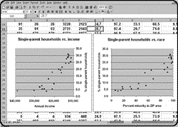 fund are removed. The current
contributions, as large as they are, will not be enough to fund payouts at current levels after
2030. These kinds of assertions have a basis in politics, not reality, and most people tend to
view them with skepticism anyway. What I'll call the seven deadly sins of statistical
innumeracy are deadlier than outright lies, because even those who create and spread
statistical nonsense tend to believe their data at least approximate the truth.
fund are removed. The current
contributions, as large as they are, will not be enough to fund payouts at current levels after
2030. These kinds of assertions have a basis in politics, not reality, and most people tend to
view them with skepticism anyway. What I'll call the seven deadly sins of statistical
innumeracy are deadlier than outright lies, because even those who create and spread
statistical nonsense tend to believe their data at least approximate the truth.
Let us count the ways...
Sin the first: Non-response bias, or the non-representative sample. This is the biggest
sin of all, and by far the most common, because no one doing a study beyond the most trivial
can sample everybody or everything, and only mind readers can be sure of what they've
missed. Unless, of course, they missed things on purpose.
Paul Cameron, a former
University of Nebraska assistant professor who now heads a group called the Family Research
Institute, claims that gay men have  an average life expectancy of 43 years.1 He and his co-authors
calculated that figure by
checking urban gay newspapers for obituaries and news stories about deaths. But as Walter
Olson pointed out in Slate last December,
this method produces an unrepresentative sample that includes only those who die; gay men
of the same generation who live longer aren't in the sample at all! The sample also is biased
toward urban gays who have AIDS and have come out of the closet.
an average life expectancy of 43 years.1 He and his co-authors
calculated that figure by
checking urban gay newspapers for obituaries and news stories about deaths. But as Walter
Olson pointed out in Slate last December,
this method produces an unrepresentative sample that includes only those who die; gay men
of the same generation who live longer aren't in the sample at all! The sample also is biased
toward urban gays who have AIDS and have come out of the closet.
It is easy to test Cameron's assertion. The average age of AIDS victims at death has been
about 40. No more than 20 percent of gay men were destined to die of AIDS before protease
inhibitors came along. But let's say the number was actually 50 percent. Even with that wild
overestimate, the average gay man who doesn't have AIDS would have to die at age 46 to
conform to Cameron's 43-year life expectancy. Or, to state the problem another way, if the
average non-HIV-positive gay male lived to be 70 (still dying almost 10 years younger than
heterosexual men) and half of all gay men were  HIV-positive, the average gay AIDS patient
would have to die at 16 to conform to Cameron's average.
HIV-positive, the average gay AIDS patient
would have to die at 16 to conform to Cameron's average.
This didn't keep former Secretary of Education William Bennett from quoting Cameron on
ABC's "This Week" last November, or from
repeating the assertion a few weeks later.
How much surveying is enough? Well, it depends. A sample of 30 or 40 might be more than
enough in a workplace of 100 people, or in a homogeneous group of lab animals. But even a
huge sample may not give us everything we want. The Bureau of the Census calls on almost 60,000 families
every month on behalf of the Bureau of Labor Statistics,
asking (among other things) about employment. That's obviously a big sample. But New York
state's share is about 1,200 families; New York City's, about 600; black New York City
families, about 200. How, then, do we use the sample to divine incidence of teen-age black
unemployment from 200 black families in New York City, not all of whom have teen-agers?
The answer is that we don't. The feds "enrich" the sample periodically for special studies so
that they can get meaningful results. They don't do it every month. But that doesn't stop
spokespeople for various causes from pretending they do, or that enriched data are available
for any conceivable subsample. In fact, the New York City area is one of only three
metropolitan areas for which monthly employment data are released at all. The survey also
understates unemployment slightly, because it only asks about family members' status during
the survey week, not the rest of the month.
Political campaign polling suffers from the same problem. If a well-conducted poll of 1,000
voters says candidate X is 5 or 6 points ahead of candidate Y, you can indeed believe there's a
good chance that X is ahead. But news organizations conducting such polls spend too much
money on polls to stop there. They need to stretch the data into longer stories, so they report
on subsamples, such as "black Republican women." The data are almost always statistically
dubious and often absolutely meaningless. But such reports, conveniently, can never be
proven wrong. In the final election, everyone's ballot looks the same.
To illustrate the problem of a small sample size, let's poll some pennies on how they will
"vote"--heads or tails. We understand intuitively that if we poll many thousands of pennies,
and if the poll is fair (by making sure each penny's weight distribution is symmetrical with
respect to head and tail), the votes for heads and tails will be about equal.
How equal? We also know intuitively that if we poll only 10 pennies, a streak or run of
luck might produce seven or eight votes for heads or tails. 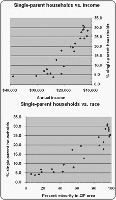 If we repeatedly poll a thousand
pennies, the streaks tend to even out, but not completely. In fact, the vote will turn out to be
500 heads, plus or minus 35, about 19 times out of every 20 we do the poll. That
plus-or-minus margin of error tends to get smaller as a percentage of the "head votes" as the
sample
size grows beyond 1,000. Jacques Bernoulli figured this out 300 years ago.
If we repeatedly poll a thousand
pennies, the streaks tend to even out, but not completely. In fact, the vote will turn out to be
500 heads, plus or minus 35, about 19 times out of every 20 we do the poll. That
plus-or-minus margin of error tends to get smaller as a percentage of the "head votes" as the
sample
size grows beyond 1,000. Jacques Bernoulli figured this out 300 years ago.
Sin the second: Mistaking statistical association for causality. In one of the statistical
exercises I force upon all journalism students at Columbia, they plot a scattergram of census
data on single-parent households in the Bronx. Sure enough, as the percentage of minority
members in a ZIP-code area increases, so does the percentage of single-parent households.
From the same data, students then plot a scattergram with household income on the X axis
instead of race. The plot looks roughly the same but with slightly more obvious clustering of
the trend. Which "association" better predicts the "variance" in single-parent households? In
general, the more predictive a variable is, the more likely it is to be causal.
In the Bronx, more careful observation suggests that income is responsible for most of the
variance. But just across the river in New Jersey, the well-off (and largely white) town of
Edgewater has the highest incidence of single-parent households in Bergen County. There, a
preponderance of relatively inexpensive two-bedroom rental apartments, ideal for women and
children from newly separated families, may be responsible. Drawing a distinction between
association and causation can help a reader avoid thinking in terms of stereotypes.
Sin the third: Poisoned control. Most studies of broad public interest compare the
fate of blighted souls--those exposed to Agent Orange, or second-hand smoke, or silicone
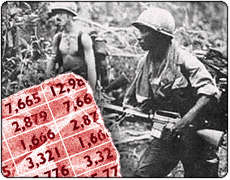 breast implants--with a
"control group" of more fortunate folks who may still suffer, but not
from whatever we are studying at the time. Statistical science will never settle the question of
Vietnam-era exposure to dioxins in Agent Orange, because the stuff was everywhere (making
it tough to find an unexposed control group). Also, the level and exact types of dioxins,
manufacturing impurities, varied by a factor of 100 in different vendors' Agent Orange
compounds. The Army lost track of who was exposed to each vendor's product.
breast implants--with a
"control group" of more fortunate folks who may still suffer, but not
from whatever we are studying at the time. Statistical science will never settle the question of
Vietnam-era exposure to dioxins in Agent Orange, because the stuff was everywhere (making
it tough to find an unexposed control group). Also, the level and exact types of dioxins,
manufacturing impurities, varied by a factor of 100 in different vendors' Agent Orange
compounds. The Army lost track of who was exposed to each vendor's product.
Because science could not settle the issue, politics did: The Vietnam vets get treatment for
dioxin-related diseases. But the money for that is an annual target in Congress and at the Pentagon, because the payments
"aren't supported by the epidemiology."
Sin the fourth: Data enhancement. Well-meaning people often are among the
guiltiest parties here. They try to scare us into driving safely by tallying holiday deaths.
Indeed, headlines like "400 killed on the highways over long weekend" sounds bad--unless we
understand that roughly 400 people are killed in any three-day period, on average, in the
United States. Figures placed in context may not sound as impressive but carry more real
meaning.
Extrapolation is a similar source of confusion. Another commonly quoted statistic is that most
auto accidents happen within 10 miles of home, on familiar roads. True. But most driving is
done within 10 miles of home. And actually, we don't know where a car's "home" is, only
where it is supposedly garaged (that's what's on state registration forms). Data enhancement
would suggest that the farther away from the registration address you drive, the safer you will
be. An article in the Journal of Irreproducible
Results thus suggested setting up an agency to register all cars  in Antarctica as a
way to improve auto safety.
in Antarctica as a
way to improve auto safety.
In the real world, when extrapolation is justifiable, straight-line or exponentially increasing
extrapolation often is not, although most studies assume one or the other. During his first
tenure as Environmental Protection Agency chief in the early 1970s, William D.
Ruckelshaus spoke about the increased use of cars and decreased amount of car pooling
for commuting. "In 1960," he said, "each car entering a central city had 1.7 people in it. By
1970, this had dropped to less than 1.2. If present trends continue, by 1980 more than one
out of every 10 cars entering a city center will have no driver!" Not all the journalists at the
press conference got the joke.
Sin the fifth: Absoluteness. The dynamics of how the popular reporting process
simplifies complex data are a source of amazement to a numerate observer. We should all be
suspicious, of course, of complex data reduced and reported as a single number. But the fault
is often not in the original study, but in the reporting.
The federal government does not publish a comprehensive cost-of-living index. The consumer price index for all urban wage
earners (CPI-U) is the usual surrogate but does not include all consumers (especially
retirees) nor all consumer spending. A blue-ribbon panel of economists two years ago
suggested three reasons why the CPI-U overstated the cost of living by 0.6 percent to 1.6
percent a year. Since then, the CPI-U has gone through its once-a-decade adjustment. And
including one of the reasons--that people substitute chicken for steak, pasta for chicken when
they can't afford what they really want--seems more a matter of politics than science. But the
panel's report was approximated by broadcasters and headline writers as "1 percent." Now Sen.
Daniel Patrick Moynihan suggests reducing Social Security payouts by one percentage point
below the CPI rise each year. The uncertainty, complexity, and range of the many variables
reflected in the  panel's report (e.g., improving quality of products with similar prices,
consumers' tendency to shop at sales, an underestimated rise in housing costs, etc.) hardly
supports a clear-cut estimate that the CPI-U is simply one point too high--but complex data
make for confusing television.
panel's report (e.g., improving quality of products with similar prices,
consumers' tendency to shop at sales, an underestimated rise in housing costs, etc.) hardly
supports a clear-cut estimate that the CPI-U is simply one point too high--but complex data
make for confusing television.
Such uncertainties are not always due to imperfections in the data. They may be due to
random chance. The public has a great deal of trouble understanding this. About 1,500 cancer clusters have been
identified, for instance, and most of the clusters with any plausible, possible source have been
investigated. No causal relations have ever been found. The public certainly understands the
plight of children afflicted with cancer, but most if not all clusters are probably due to chance.
As one of my students, Kirsty Sucato, pointed out in her master's project last year, if you have
64 grains of rice and throw them into a box with a chessboard at the bottom, the rice will not
arrange itself one grain to a square.
Sin the sixth: Partiality. Tobacco industry studies showed no health problems with
tobacco use. Hershey funded a study that showed no relation between acne and chocolate
consumption. A study in the January 8,
1998, issue of New England Journal of Medicine analyzed 70 articles on calcium
channel blockers for treating angina and hypertension; some 96 percent of the authors of
favorable articles had financial links to companies making such drugs, while only 37 percent
of the authors of 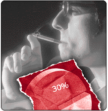 critical articles had such ties. The public may discount these observations
when the ties are obvious. The bigger problem is that the thumb on the statistical scale pushes
people to study things that aren't always worth studying, and to ignore things that are more
important.
critical articles had such ties. The public may discount these observations
when the ties are obvious. The bigger problem is that the thumb on the statistical scale pushes
people to study things that aren't always worth studying, and to ignore things that are more
important.
A Republican Congress has been opposed to statistical adjustments in the census, noting that
blacks and Hispanics, who are historically more likely to vote Democratic, are undercounted
(roughly 4.4 percent for blacks, 5 percent for Hispanics). The undercount for whites is only
0.7 percent. But because almost four out of every five U.S. residents is white and
non-Hispanic, the number of undercounted non-Hispanic whites, non-Hispanic blacks, and
Hispanics is each about the same--1.4 million. New York politicians claim the undercount cuts
city revenue from the federal government, but if the population were to be adjusted, Congress
would probably adjust the funding formulas to keep payments unchanged. The real issue is
Congressional apportionment, which skews the decision-making to non-urban areas, a matter
of little immediate concern to the general public at all.
Sin the seventh: A bad measuring stick. The most commonly used statistical
measuring stick is money. We count the cost of cancer to society, not the emotional cost to
victims. We count the time lost commuting, not--well, the emotional cost to the victims.
Economic accounting is often a  useful approach but it leads to oddities, often because the
money saved by making a car less safe or an environmental regulation less restrictive is
inconsequential compared to the cost falling on the few victims. In the controversy over the
hazards of second-hand smoke, it leads us to concentrate on cancer rather than on directly
observable but less costly effects such as allergic reactions.
useful approach but it leads to oddities, often because the
money saved by making a car less safe or an environmental regulation less restrictive is
inconsequential compared to the cost falling on the few victims. In the controversy over the
hazards of second-hand smoke, it leads us to concentrate on cancer rather than on directly
observable but less costly effects such as allergic reactions.
Likewise, most people are exposed to less pollution now than a generation ago, on average,
even though the economy and the population have been growing. There are many serious
environmental issues still on the table, of course. But for most of us, air and water are much
safer than they were in the early 1970s, when the first major national environmental laws
were passed.
Alternatives to bafflement
What can we make of all this? New statistical methods appear every few days. The Journal of the
American Medical Association, in fact, reports that authors of its papers have
accelerated their adoption of new statistical tests. Even  university-educated statisticians have
trouble keeping up. What about journalists and others who have received little or no
statistical training?
university-educated statisticians have
trouble keeping up. What about journalists and others who have received little or no
statistical training?
I recommend looking at Census and Bureau of Labor Statistics reports. Compare the care and
honesty with which professional statisticians at these agencies lay out their methods and their
results on issues of enormous interest to the public. Demand that others who offer up a daily
dose of numbers do the same.
Related links...
American Statistical Association
Statistics Every Writer Should
Know, Robert Niles
National Center for Health Statistics,
Centers for Disease Control and Prevention
Information Please
STAT-USA, business and economic statistics
site, U. S. Commerce Dept.
Stuart Sutherland, Irrationality: Why We Don't Think
Straight (New Brunswick, NJ: Rutgers UP, 1994)
How Much, How
Many? Statistical Sources and Calculation Tools on the Net, St. Ambrose University,
Davenport, Iowa
Consumer Price Index
overview, Bureau of Labor Statistics
Curriculum vitae
for Prof. Ross, from Earth & Environmental Science Journalism program
Statistical study of players'
performances in 1998 World Series, Jay Bennett, ASA's Statistics in Sports section
1. Cameron, P., Playfair, W.L., Williams, S. The longevity
of homosexuals: before and after the AIDS epidemic. Omega 29 (1994):
249-272.
STEVEN S. ROSS is
associate professor of professional practice at Columbia's Graduate School of Journalism. He has authored or
edited 18 books, including SPREADSTAT: How to Build Statistics into Your Lotus 1-2-3
Spreadsheets (NY: McGraw-Hill, 1989) and many others discussing statistical
methods. His baccalaureate from Rensselaer Polytechnical
Institute was in physics.
Photo Credits:
|
Stock Photos: AIDS Ribbon; Mother & Child / Definitive Stock Car Crash / Photos Etc. U.S.
Troops in Vietnam / Courtesy of the Vietnam War Photo Album |
| |
Special Computer Effects: Howard Roberts |