
American dictionary of printing and bookmaking
(New York : H. Lockwood, 1894.)
|
||

 Click here and hold to drag menu around
|


|
|
|
|
| Page 228 |
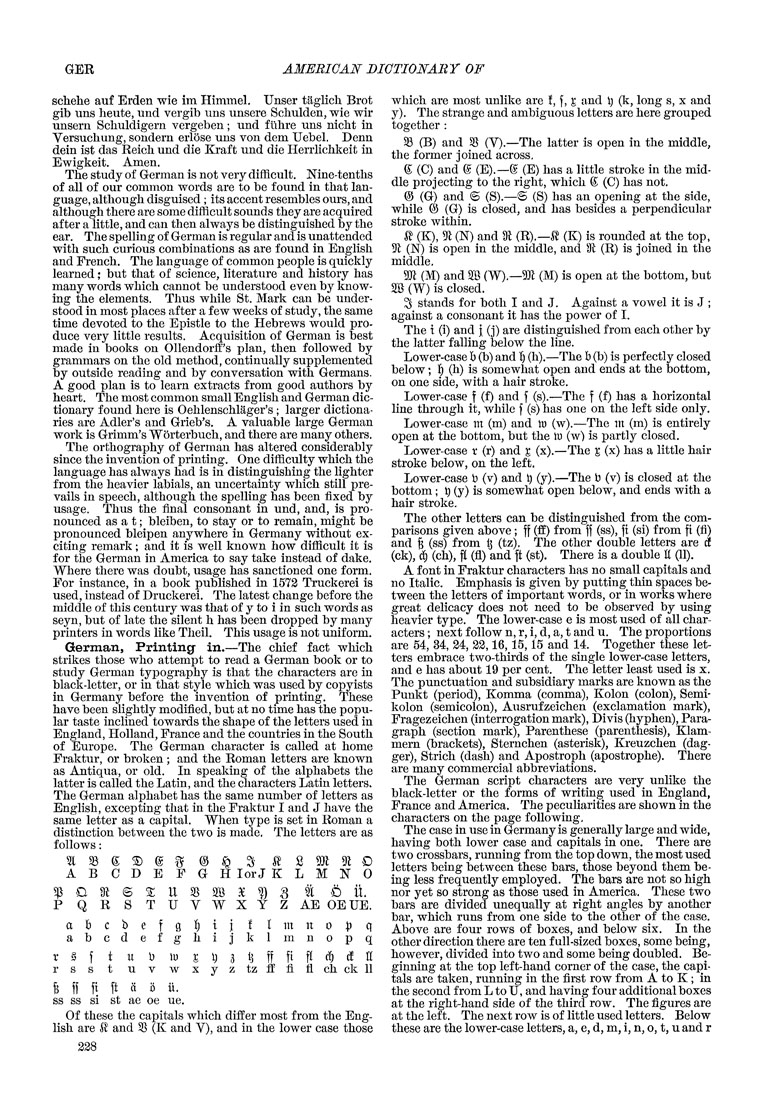
GER AMERICAN DICTIONARY OF schehe auf Erden wie im Himmel. Unser taglich Brot gib uns heute, und vergib uns unsere Schulden, wie wir unsern Schuldigern vergeben; und f iihre uns nicht in Versuchung, sondern erlose uns von dem Uebel. Denn dein ist das Reich und die Kraft und die Herrlichkeit in Ewigkeit. Amen. The study of German is not very difficult. Nine-tenths of all of our common words are to be found in that lan¬ guage, although disguised ; its accent resembles ours, and although there are some difficult sounds they are acquired after a little, and can then always be distinguished by the ear. The spelling of German is regular and is unattended with such curious combinations as are found in English and French. The language of common people is quickly learned; but that of science, literature and history has many words which cannot be understood even by know¬ ing the elements. Thus while St. Mark can be under¬ stood in most places after a few weeks of study, the same time devoted to the Epistle to the Hebrews would pro¬ duce very little results. Acquisition of German is best made in books on 011endorft''s plan, then followed by grammars on the old method, continually supplemented by outside reading and by conversation with Germans. A good plan is to learn extracts from good authors by heart. The most common small English and German dic¬ tionary found here is Oehlenschlager's ; larger dictiona¬ ries are Adler's and Grieb's. A valuable large German work is Grimm's Worterbuch, and there are many others. The orthography of German has altered considerably since the invention of printing. One difficulty which the language has always had is in distinguishing the lighter from the heavier labials, an uncertainty which still pre¬ vails in speech, although the spelling has been fixed by usage. Thus the final consonant in und, and, is pro¬ nounced as a t; bleiben, to stay or to remain, might be pronounced bleipen anywhere in Germany without ex¬ citing remark; and it is well known how difficult it is for the German in America to say take instead of dake. Where there was doubt, usage has sanctioned one form. For instance, in a book published in 1572 Truckerei is used, instead of Druckerei. The latest change before the middle of this century was that of y to i in such words as seyn, but of late the silent h has been dropped by many printers in words like Tlieil. This usage is not uniform. German, Printing in.—The chief fact which strikes those who attempt to read a German book or to study German typography is that the characters are in black-letter, or in that style which was used by copyists in Germany before the invention of printing. These have been slightly modified, but at no time has the popu¬ lar taste inclined towards the shape of the letters used in England, Holland, France and the countries in the South of Europe, The German character is called at home Fraktur, or broken ; and the Roman letters are known as Antiqua, or old. In speaking of the alphabets the latter is called the Latin, and the characters Latin letters. The German alphabet has the same number of letters as English, excepting that in the Fraktur I and J have the same letter as a capital. When type is set in Roman a distinction between the two is made. The letters are as follows: ABCDEFGH lor J K L M N 0 ^C9^©^U353B3e?)3 ft Oil. P Q R S T U V W X Y Z AE OEUE, a b c b e f g 1^ i } ! I m n o |) q abcdefghijklmnopq r g f t u b lu ^ I) a 13 ff fi ft <^ ^ n r s s t u V w X y z tz ff fi fl ch ck 11 § ff ft ft ci 0 ii. ss ss si st ae oe ue. Of these the capitals which differ most from the Eng¬ lish are ^ and 35 (K and V), and in the lower case those which are most unlike are !, f, l and I) (k, long s, x and y). The strange and ambiguous letters are here grouped together : 33 (B) and 35 (V).—The latter is open in the middle, the former joined across, ^ (C) and (g (E),—(^ (E) has a little stroke in the mid¬ dle projecting to the right, which (^ (C) has not. % (G) and © (S).—© (S) has an opening at the side, while (^ (G) is closed, and has besides a perpendicular stroke within. ^ (K), 5^ (N) and 9^ (R).—.^ (K) is rounded at the top, 5fl (N) is open in the middle, and 91 (R) is joined in the middle. m (M) and B (W).—9Jl (M) is open at the bottom, but SB (W) is closed. ^ stands for both I and J. Against a vowel it is J ; against a consonant it has the power of I. The t (i) and j (j) are distinguished from each other by the latter falling below the line. Lower-case b (b) and !) (h).—The b (b) is perfectly closed below; 1^ (h) is somewhat open and ends at the bottom, on one side, with a hair stroke. Lower-case f (f) and f (s).—The f (f) has a horizontal line through it, while f (s) has one on the left side only. Lower-case m (m) and in (w).—The m (m) is entirely open at the bottom, but the in (w) is partly closed. Lower-case r (r) and x (x).—The % (x) has a little hair stroke below, on the left. Lower-case b (v) and t) (y).—The b (v) is closed at the bottom; ^ (y) is somewhat open below, and ends with a hair stroke . The other letters can be distinguished from the com¬ parisons given above; ff (ff) from ff (ss), ft (si) from ft (fi) and § (ss) from tj (tz). The other double letters are d (ck), ^ (ch), ft (fl) and ft (st). There is a double It (11). A font in Fraktur characters has no small capitals and no Italic. Emphasis is given by putting thin spaces be¬ tween the letters of important words, or in works where great delicacy does not need to be observed by using heavier type. The lower-case e is most used of all char¬ acters ; next follow n, r, i, d, a, t and u. The proportions are 54, 34, 24, 22,16,15,15 and 14. Together these let¬ ters embrace tv/o-thirds of the single lower-case letters, and e has about 19 per cent. The letter least used is x. The punctuation and subsidiary marks are known as the Punkt (period), Komma (comma), Kolon (colon), Semi- kolon (semicolon), Ausrufzeichen (exclamation mark), Fragezeichen (interrogation mark), Divis (hyphen). Para¬ graph (section mark), Parenthese (parenthesis), Klam- mern (brackets), Sternchen (asterisk), Kreuzchen (dag¬ ger), Strich (dash) and Apostroph (apostrophe). There are many commercial abbreviations. The German script characters are very unlike the black-letter or the forms of writing used in England, France and America. The peculiarities are shown in the characters on the page following. The case in use in Germany is generally large and wide, having both lower case and capitals in one. There are two crossbars, running from the top down, the most used letters being between these bars, those beyond them be¬ ing less frequently employed. The bars are not so high nor yet so strong as those used in America. These two bars are divided unequally at right angles by another bar, which runs from one side to the other of the case. Above are four rows of boxes, and below six. In the other direction there are ten full-sized boxes, some being, however, divided into two and some being doubled. Be¬ ginning at the top left-hand corner of the case, the capi¬ tals are taken, running in the first row from A to K ; in the second from L to U, and having four additional boxes at the right-hand side of the third row. The figures are at the left. The next row is of little used letters. Below these are the lower-case letters, a, e, d, m, i, n, o, t, u and r |
| Page 228 |