1. Soft Shadows
Shadows have always been devices that designers use to add sense of depth to their graphics and text. Soft
shadows are used for the same reasons. I do not think you will disagree with me that these shadows look
really pretty. No wonder there are used practically everywhere.
 Just how do you make soft shadows? First, you will need a photo-paint type program to create soft
shadows. The current industry standard is Adobe System's Photoshop. If you cannot afford to pay $150 for
Photoshop (academic price), you can justifiably opt for shareware programs that do more or less the same
thing.
Just how do you make soft shadows? First, you will need a photo-paint type program to create soft
shadows. The current industry standard is Adobe System's Photoshop. If you cannot afford to pay $150 for
Photoshop (academic price), you can justifiably opt for shareware programs that do more or less the same
thing.
My favorite shareware graphics program is Paint Shop Pro for Windows. (You can download this program
from the Moment Home Page.) But since different people prefer different programs that implement specific
features differently, I will try generalize my explanations to basic concepts rather than giving step-by-step
procedures.
Once you have your graphics program running, then what follows is trivial. To create a soft shadow, first
type in the desired text in light gray. This is your shadow. To make it soft, use a "soften" or "blur" filter
from somewhere hidden in the menu structure. You will immediately see the blurring effect on the gray
text.
Repeat the "soften" or "blur" commands a few times until you get the right amount of fuzziness. Finally,
type in the text again, this time with the solid color of your choice, and overlay it on top of the software
shadow. Make sure you offset the solid text a little bit to the upper-left to simulate the casting of the
shadow.
2. Anti-Aliasing
You may have already realized that the graphical texts in corporate pages always look smoother and those
in your page. This is because designers always use anti-aliasing to smooth out jagged edges of fonts under
the display relatively low resolution of computer monitors.
Anti-aliasing algorithms generally uses intermediate colors to create the illusion of smoothness along the
 edges of text and graphics. The actual mechanism is not really important. Just make sure that as you are
typing in text in a graphics program, that the option for anti-aliasing is checked. Your text will be smoothed
out automatically.
edges of text and graphics. The actual mechanism is not really important. Just make sure that as you are
typing in text in a graphics program, that the option for anti-aliasing is checked. Your text will be smoothed
out automatically.
For those of you who have colored backgrounds on your home page, make sure that you first match the
background color of the graphic you are working to that of your homepage. Anti-aliasing algorithms works
by blending the background color with the text color. Failure to match background colors might cause an
ill-colored outline to emerge when you place the graphic on top of your home page.
You should wholly avoid anti-aliasing if you have a complex, multi-colored background images. There are
in fact work arounds, but those details will not be discussed in this article.
3. Transparent GIFS
Not every picture or graphic should be or needs to be enclosed in a standard rectangular box. Some great
example of the use transparent GIFs can be found on MTV Online http://www.mtv.com.
Photo-paint programs will allow you to save a graphic in GIF 89a format. This particular type of GIF will
allow to assign the background color to a transparent.
When you layer this transparent GIF on top of your texture background, the texture will show through in
places that are transparent.
You should also remember to use <IMG SRC BORDER=0> to make sure that no boxes are drawn around
your GIF even if you make the graphic an active link.
4. Counter
 You have seen it. You want it. But you cannot get it on your home page because Columbia/AcIS does not
provide the CGI script required for a graphical counter? Don't worry.
You have seen it. You want it. But you cannot get it on your home page because Columbia/AcIS does not
provide the CGI script required for a graphical counter? Don't worry.
You can request a free counter from the popular Web Counter Service at http://www.digits.com Detailed
instructions can be found online, therefore I will stop here.
5. Image maps
The basic construct behind image map is there is a hyperlinks "map" on top of a large "image." By clicking
on different regions of the image, different links will be accessed depending on how the image map file is
set up.
A lot of cool sites use imagemap to replace line after line of text; rather, the users can choose he or she own
destiny by clicking on different regions within the large graphic.
I made my logo "T..o..p..h..e..r" a imagemap on my personal home page
http://www.columbia.edu/~topher. Each letter of my name leads you (or me) to one of my favorite sites.
The actual coding of imagemaps on the Columbia server is relatively cumbersome. However, the online
documentations are very complete and easy to follow
http://www.columbia.edu/httpd/cgi/imagemap.html.
Shareware programs that allow you to graphically draw out the actual mapped regions are invaluable time-
savers. My favorite is MapThis! which is also available from the Moment Home Page.
Microsoft's Internet Explorer supports something called a client side imagemaps which does not require
access to any sort of CGI scripts. Everything necessary for the implementation of a imagemap is nicely
contained within the HTML document.
Image mapping is a relatively complex subject for beginners. Lots of documentation reading and
experimenting are recommended. But once you know how to do one image map, you know how to do
them all.
6. The "Don't Leave" Links
Are you paranoid that people who accesses the links from your home page do not come "back" to your
page after spawning out into the Net with your links? Worry no more. If you replace your usual <A HREF>
tag with <A target=window HREF>, that every time you or someone else clicks on that link, a new
Netscape window will pop up and display the linked page, while your own page remains open and
unharmed in the background window.
With this implementation, visitors to your page might just stay a little longer and access every link you
provide. Do you feel better now?
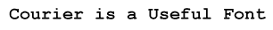
7. Courier
Times Roman is the standard font in used in Web browser. As you may already know, there are several font
tricks such as small caps, big first letter and font size changing that a Web designer can employ to give that
professional look.
Sometimes amateur designers sometimes forgot the power of the good old Courier font. Courier is very
effective as headline fonts. There are often clearer and more elegant than the notoriously bold Times
Roman.
You can designate a text phrase to be Courier (or in rare cases, some other fixed pitch fonts) by tagging the
words with <tt>.</tt>.
8. Nested Tables
Tables seem to be the main topic of discussion when Net surfers discuss the cool Netscape extensions.
Most people have no problem mastering how to make a simple 3 columns by 10 rows table after glimpsing
through the online documentation on the Netscape server.
However, the REAL power of tables can only be realized when you start nesting them-which means, place
a table within a cell of another table.
The concept of programming nested tables is not fundamentally difficult. However, one needs to be very
careful in keeping track of the complex tag structure.
You will have to experiment in order to get a feel the "natural tendencies" of nested table in such context as
width adjustment and text alignment. From my experience, this learning process is indeed not a trivial one.
Once you have mastered the most complex nested tables, then you will have complete freedom over
placement of objects on your home page.
The Moment Home Page http://www.columbia.edu/cu/moment (especially our front page) is a good
example of how semi-complex nested table can help maximize screen real estate and enhance the look of
the overall structure.
Please note that the tag border=0 is added to the <table> tag to eliminate the table grid. You will often get a
much cleaner, more professional layout if you do not have excessive grids or lines.
9. Space.gif
This space.gif is nothing more than a small, completely transparent GIF. Since Netscape allows us to scale
graphics with the WIDTH= and HEIGHT= tags, we can use space.gif as unobtrusive fillers to indent objects
from the left margin for a specified number of pixels.
This allows the designer much more flexibly than tags such as unnumbered lists and <BLOCKQUOTES>
which indents the objects or paragraphs for a preset distance every time they are used.
With space.gif, you can type in <IMG SRC WIDTH=333 HEIGHT=400>space.gif</A> can know quite well
that the first element to the right of the "space will be 333 pixels from the left most edge of the displayable
screen."
10. Split Screen (Netscape 2.0 Extension)
Aside from the addition of Java, Sun Microsystems's object oriented scripting language, the new version of
Netscape, (2.0 to be specific), also allows you to split your screen into two or more sections and display
different HTML files in each display pane.
This type of screen splitting is the most useful when a button bar is place in a small pane that remains visible
 all through a browsing process. Netscape provides some good examples of split panes and has extensive
online documentation for your reading pleasure.
all through a browsing process. Netscape provides some good examples of split panes and has extensive
online documentation for your reading pleasure.
I recommend you to check out the home page of Tom Thai, our Layout Editor
http://www.columbia.edu/~tt70. Tom has a very simple but effective implementation of this new
Netscape feature. (Of course, the rest of his page is really nice, too)
* * * *
If you are still with me at this point, congratulations. I hope you will enjoy using these tips and tracks to
create home pages that are impressive enough to may be launch you a Web designing job.
If you are confident about your Web making ability, you should contact the Columbia University Web
League (CUWL) and ask if they are hiring any Web designers right now. You can also visit their home page
at http://www.columbia.edu/cu/ccs/cuwl.