
There has been a ton of recent work attempting to “discover” causal structure from data in climate science (Jakob Runge and coauthors’ review paper gives a nice summary).
However this project looks at causality through a very different lens and examines how causal graphs1, a fundamental from causal theory, can be used to clarify assumptions, identify tractable problems, and aid interpretation of results in climate research. The goal is to distill the basics of the graphical approach to causality in a way that is relatable for climate scientists.
To build a causal graph, a researcher draws arrows from causes to affected variables. Here is a toy (simplified) example involving sunlight (at the earth’s surface), clouds, and aerosols2:
From a young age we know that clouds reduce sunlight (arrow from cloud to sunlight). Aerosols also reduce sunlight by reflecting it back to space (arrow from aerosol to sunlight), and they impact clouds by providing a surface for water vapor in the air to condense/deposit onto (arrow from aerosol to cloud). These diagrams are very intuitive for many domain scientists to draw, but they also have a formal mathematical meaning with rigorous underlying theory3. The fun part is we can use this theory to play all sorts of games.
One of the powers of causal graphs’ underlying theory is that we can automatically analyze (from the graph) which variables we need to control for in order to calculate a causal effect, and whether calculating a causal effect is even possible.
Returning to our toy example may help here as well: consider a situation where we have observations of cloud and sunlight, and we want to calculate our expectation for how much sunlight would decrease if we intervened (“played god” in the modeling sense) and added clouds on a sunny day. If we naively just bin data by cloudy and clear days, and calculate the difference in sunlight between each type of day:
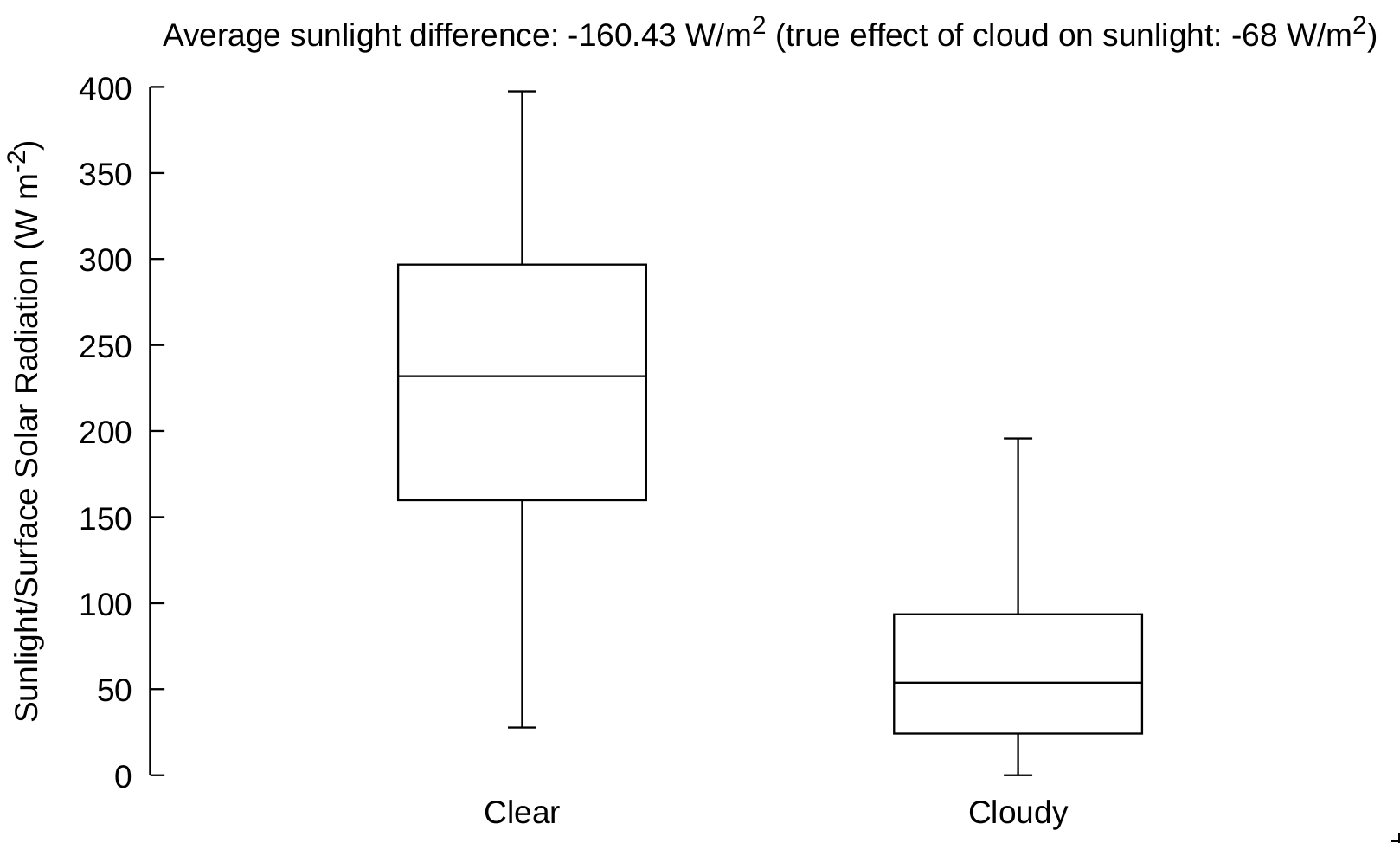
We find that the average decrease in sunlight on cloudy days is about 160 W/m2 4. However, because we drew a causal graph we can analyze if we need to control for any variables in order to calculate the true causal effect of adding a cloud to our sunny day. Details are in the paper, but if we do this we find that we need to control for aerosol. Controlling for aerosol with regression (again details are in the paper):
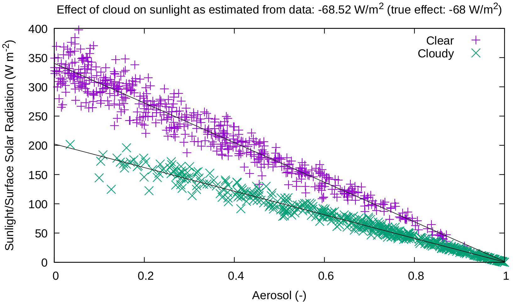
results in a causal effect of cloud decreasing sunlight by 68.5 W/m2, much less than our original estimate of 160 W/m2. This toy example was done on generated rather than real data, so we know the “true” causal effect, which is 68 W/m2. If we do not adjust for aerosol, we get a very wrong estimate of our causal effect, but if we do, we are very close to the truth!
Further, if we were confronted with a scenario where we don’t have access to aerosol observations, we would not be able to calculate the causal effect, no matter how many samples of cloud and sunlight were available. In this way, we can analyze our causal graphs in light of available observations to determine whether calculating a causal effect is possible, before we have to deal with any tedious (and time consuming) collection or downloading of data!
To summarize, causal graphs allow us to:
However, even if a causal interpretation is impossible given our graph, we think it is still very useful to draw a causal graph and present it with the research. It still communicates the researchers’ assumptions about how the system works, and communication is hard enough as it is, so we should use as many tools as we can. Readers/viewers can use the graph to analyze for themselves the possible sources of confounding and co-variation that could not be accounted for in the analysis, and reason about what their impact may have been (for example: large or small; positive or negative). A causal graph can aid communication and interpretation even if the analysis is not causal.
Toy examples are useful for understanding, but are causal graphs useful for real applications? To answer, I went back to an an old field campaign I was a part of at UAlbany. We were trying to estimate the effect of rain regime5 on rainfall patterns in the Nahuelbuta mountains in Chile. Here is a graph for that system:
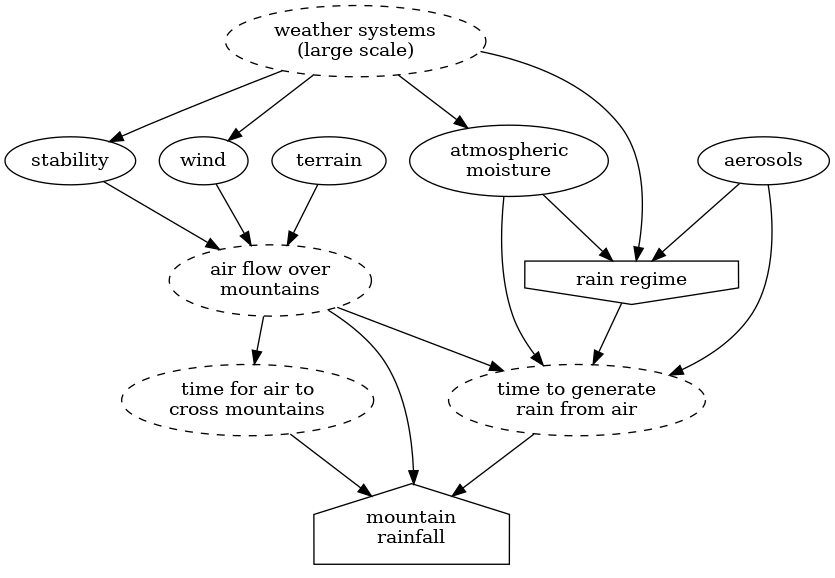
The details of what everything means aren’t that important. What is important is that it is impossible or too expensive to observe everything (any variable with a dashed circle is unobserved), but if we analyze the graph in terms of what we did observe during the campaign, we find that we can calculate the causal effect of rain regime on mountain rainfall, which was the goal of the project. This comes as no surprise to me, because the designers of the campaign (René Garreaud, Justin Minder, Jefferson Snider, and David Kingsmill) are atmospheric science wizards. However the causal graph is nice because it proves in some sense that, subject to the clear assumptions in the graph, the design of the field campaign was sound.
This example demonstrates how causal graphs can communicate assumptions and lend a mathematically justified causal interpretation to real problems in climate. Such a causal graph could be included in any field campaign proposal, improving communication about the system and also rigorously justifying the campaign’s observations as necessary for calculating an effect. Even before the proposal, we could start with a causal graph, and then analyze the causal graph to determine which observations we need to meet our campaign’s goals. Building on this idea, we could attach costs to observing different variables, and automatically determine the set of observations that minimizes cost while still allowing us to calculate our effect of interest. This type of prior analysis could be something to consider on any future field proposal.
This is just one example to show that graphs can be useful in real applications, but there are many more possibilities. The most important point (and I know I’m getting repetitive but I want to hammer it home) is that causal graphs are useful for communicating assumptions and structuring/organizing analyses.
That was longer than I expected; apologies. Despite the length I glossed over or neglected a bunch of important details, which are available in our manuscript on arxiv, with coauthors Pierre Gentine and Jakob Runge. Our big takeaway is to consider drawing a causal graph as a first step in future projects; it might help clarify the research process.
I am too technologically illiterate to set up a comment system on this page, but comments and questions are very welcome and encouraged through Github’s issue system: just click here! (I know it’s kind of a hack but it should work well enough.)
Judea Pearl’s bibliography is a good place for a deep dive into a lot of the theory. Personally I found that Cosma Shalizi’s textbook (Chapters 19-22) provide a concise, clear, and accessible introduction.↩︎
“aerosols” are tiny particles that float in the air.↩︎
one of my academic regrets is that I did not learn about causal graphs until I was a Ph.D. student. I would have loved a math class growing up where we were encouraged to draw diagrams for complicated problems, and then view these as valid mathematical objects/answers themselves. I think there is a lot of opportunity for causal graphs in K-12 and higher education, and while I am not super up on that field it sounds like people are using causal graphs in education.↩︎
W/m2 is a measure of the amount of sunlight. It has units of energy per unit time, per a square meter of the Earth’s surface.↩︎
These rain regimes were microphysical, which in this case just means we were interested in whether ice falling into rain clouds would change patterns of rainfall.↩︎