| Nearly every organization and institution has symbols which identify it and instill in its members a deeper understanding of its ideals. Our country has a seal and a flag, your college has a seal and each State has a flag and a seal. Sigma Phi Epsilon's symbols include its badge, its coat of arms and its flag. There are also other various symbols of our Fraternity, some of which are described below. |
The
Badge
|
  The original
badge designed by the founders had the "E"
added below the skull and bones after the badges were
made. On subsequent badges the "E" was brought
above the skull and bones to join the SF. This design,
in a slightly smaller size and with twenty pearls
bordering the black heart, remains the official badge
today.
The original
badge designed by the founders had the "E"
added below the skull and bones after the badges were
made. On subsequent badges the "E" was brought
above the skull and bones to join the SF. This design,
in a slightly smaller size and with twenty pearls
bordering the black heart, remains the official badge
today.
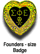 At the 1973 Grand Chapter Conclave in Denver, Colorado,
an additional official badge was authorized. This
badge is of the same size and shape as the original
founders badge and is bordered by a band of gold.
The 1973 Conclave also authorized that official badges
may be made with heavy-duty gold plate, "golklad"
in addition to white and yellow gold. The new founders-size
badge was designed by William A. MacDonough, Virginia
Epsilon (Washington and Lee University).
At the 1973 Grand Chapter Conclave in Denver, Colorado,
an additional official badge was authorized. This
badge is of the same size and shape as the original
founders badge and is bordered by a band of gold.
The 1973 Conclave also authorized that official badges
may be made with heavy-duty gold plate, "golklad"
in addition to white and yellow gold. The new founders-size
badge was designed by William A. MacDonough, Virginia
Epsilon (Washington and Lee University). |
The
Coat of Arms
|
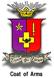 Nearly all fraternities, even the smallest locals in the smallest colleges, boast a coat of arms. A heritage from the old days of feudalism and knighthood, it is an emblem which can become almost as precious to the SigEp who has the right to wear it as his heart-shaped badge. For a long time, however, Sigma Phi Epsilon displayed a coat of arms which was not heraldically correct. The original design was adopted in 1908 at the Chicago Conclave. Frederick M. Cutler, Massachusetts Alpha '30 (University of Massachusetts), called attention to the old emblem's inaccuracies. In 1933, Mark D. Wilkins, then a field secretary for the Fraternity, consulted Arthur E. DuBois, in charge of the heraldic work for the United States Government, and the new and revised coat of arms was subsequently accepted. Nearly all fraternities, even the smallest locals in the smallest colleges, boast a coat of arms. A heritage from the old days of feudalism and knighthood, it is an emblem which can become almost as precious to the SigEp who has the right to wear it as his heart-shaped badge. For a long time, however, Sigma Phi Epsilon displayed a coat of arms which was not heraldically correct. The original design was adopted in 1908 at the Chicago Conclave. Frederick M. Cutler, Massachusetts Alpha '30 (University of Massachusetts), called attention to the old emblem's inaccuracies. In 1933, Mark D. Wilkins, then a field secretary for the Fraternity, consulted Arthur E. DuBois, in charge of the heraldic work for the United States Government, and the new and revised coat of arms was subsequently accepted.
The badge and coat of arms are the official insignia of the Fraternity; their esoteric meaning is contained in the Ritual of the Fraternity. |
The
Flag
|
 The Fraternity flag has a background of purple with a red bar extending diagonally from the upper left corner to the lower right corner, this bar fimbriated by a narrow band of gold from the purple background. In the center of the flag, mounted upon a red bar, appears a gold star of five points. The Fraternity flag has a background of purple with a red bar extending diagonally from the upper left corner to the lower right corner, this bar fimbriated by a narrow band of gold from the purple background. In the center of the flag, mounted upon a red bar, appears a gold star of five points.
The 1955 Conclave authorized an alternative form for the official flag. In this form the Greek letters SFE are placed in the upper right corner of the regulation flag while the chapter designation is placed in the lower left corner. The purpose is for plainer identification of the flag when it is used for display.
The flag with letters is commonly called the "display flag" and the plain flag the "ritual flag." Every chapter should have a display flag and a ritual flag. |
The
Alumni Recognition Pin
|
 This "Ducal Crown" (from the coat of arms) is worn as a lapel pin. In recent years this has been recognized as the alumni pin and chapters present them to graduating seniors at the annual senior banquet. This "Ducal Crown" (from the coat of arms) is worn as a lapel pin. In recent years this has been recognized as the alumni pin and chapters present them to graduating seniors at the annual senior banquet. |
Fraternity
Colors and Flowers
|
| The Fraternity colors are purple and red. The flowers are the violet and the dark red rose. |
Fraternity
Whistle
|
| The Fraternity whistle, as adopted at the 1912 Conclave, is an adaptation of the first two lines of "The Letter Song" (Nadina), from "The Chocolate Soldier," by Oscar A. Straus, an Austrian composer. |
The
Red Door
|
 The tradition of the red door on Sigma Phi Epsilon Chapter houses began at Syracuse University (New York Alpha) in the 1920s. This has become a strong tradition and as you travel to other college campuses you will look for the "red door" of Sigma Phi Epsilon where you know you will be welcome. The tradition of the red door on Sigma Phi Epsilon Chapter houses began at Syracuse University (New York Alpha) in the 1920s. This has become a strong tradition and as you travel to other college campuses you will look for the "red door" of Sigma Phi Epsilon where you know you will be welcome. |
The
Heart Symbol
|
 Designed in 1974 by Bruce N. Blackburn, Cincinnati '61, award-winning designer of the American Revolution Bicentennial symbol and NASA logo, the Fraternity's heart symbol is derived from the shape of the SigEp badge and incorporates the Greek letters SFE. But, when printed in a color other than a screen (which appears gray - never print in black), the color "warm red" is used to denote the feeling of brotherhood which it symbolizes. Designed in 1974 by Bruce N. Blackburn, Cincinnati '61, award-winning designer of the American Revolution Bicentennial symbol and NASA logo, the Fraternity's heart symbol is derived from the shape of the SigEp badge and incorporates the Greek letters SFE. But, when printed in a color other than a screen (which appears gray - never print in black), the color "warm red" is used to denote the feeling of brotherhood which it symbolizes. |
The
Balanced Man Pin
|
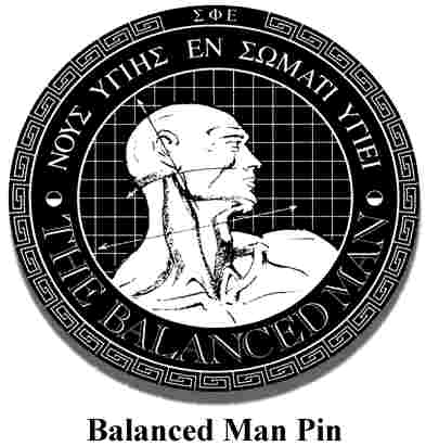 Concurrent with the Fraternity's development of a strategy in 1989, the Balanced Man symbol was created as an expresssion of the values of our Greek-letter heritage, "Spirit Healthy, Body Healthy." The Balanced Man symbol was created by the international advertising firm, TBWA, whose chief executive and chairman is Sigma Phi Epsilon Brother William G. Tragos, Washington University (Missouri Beta) '56. The Balanced Man Symbol is representative of the goals of each SigEp and each of our chapters. Concurrent with the Fraternity's development of a strategy in 1989, the Balanced Man symbol was created as an expresssion of the values of our Greek-letter heritage, "Spirit Healthy, Body Healthy." The Balanced Man symbol was created by the international advertising firm, TBWA, whose chief executive and chairman is Sigma Phi Epsilon Brother William G. Tragos, Washington University (Missouri Beta) '56. The Balanced Man Symbol is representative of the goals of each SigEp and each of our chapters. |